Ms. Nelsen's Art Classes Q1
The above quote is borrowed from MGM Studios opening credits and means “Art for Art’s Sake” which is not only how our Art Classes feel about art, but exemplifies their creativity.
Like the building blocks of the ABC’s, art also has blocks, one building upon the other to enhance learning about giving meaning to artworks. Thus, we started out the year learning about the seven Elements of Art. These are: Line, Texture, Color, Value, Shape, Form, and Space.
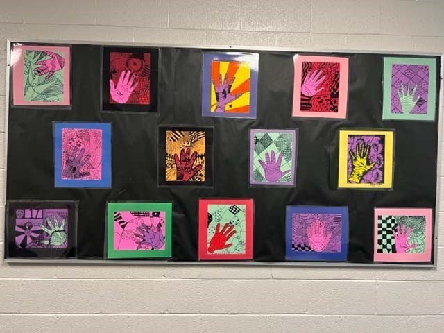
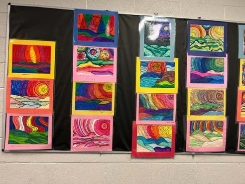
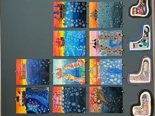
The students “Line” works gave meaning to straight lines, parallel lines, long and short lines, thin and thick lines, wavy lines, and squiggle lines. Take a look at the lines represented on the “Hand” designs they made. Using a high-top tennis shoe template, the students created designs on the shoes, which are now used as a border on our Art Gallery wall. Another class worked using lines to create “landforms.” The color patterns and formations are outstanding!
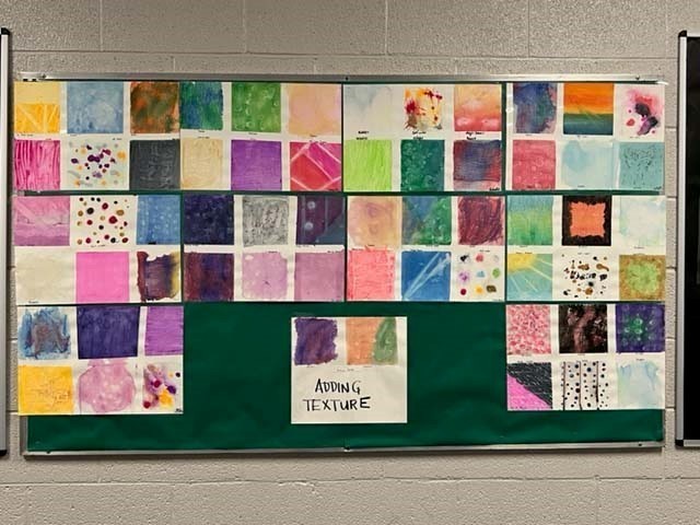
Our second building block was creating Texture with the use of salt water, rubbing alcohol, gauze, rice, blowing bubbles (the least successful), and magic erasers. It’s hard to see the texture from the photo, but their creations looked fabulous.
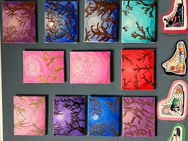
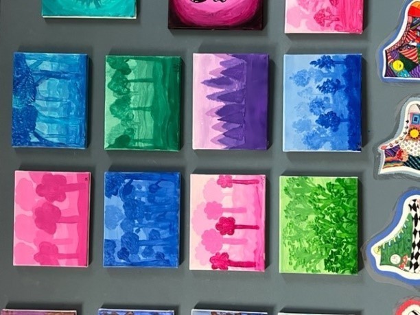
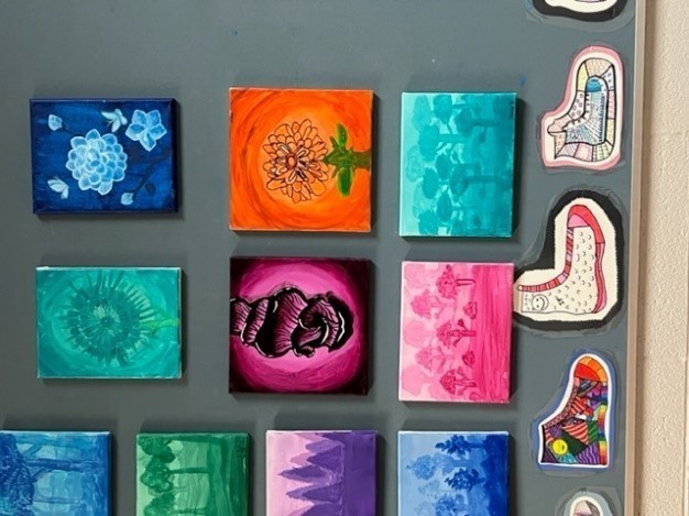
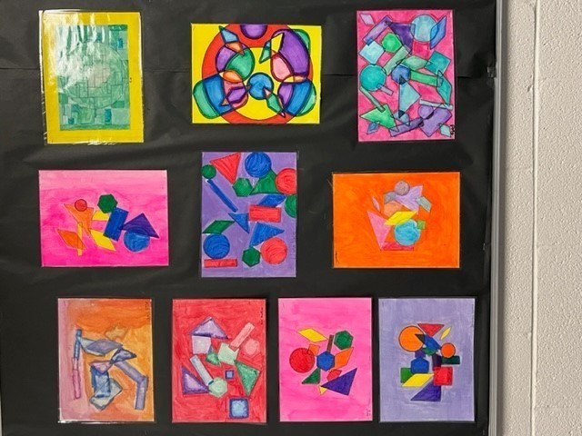
The third building block involved Color. The students learned they can mix colors to create their own which we did using color wheels. Terms such as Primary, Secondary, Tertiary, Complementary, Analogous, Warm/Cool, and Monochromatic are now part of their vocabulary. Working hand in glove with Color, Value was introduced. Value refers to how light or dark a color can be. Tint is created by adding white to a mixture, while Tone is generated by adding black. Shade is used to create shadowing. Here are examples of their various works using the elements of Color and Value. (Also note their “shoe” designs.)
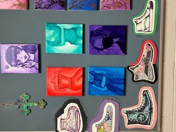
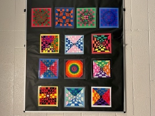
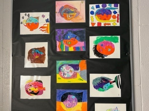
Moving into the next Element of Shape (2-Dimentional) and Form (3-Dimentional), the students created works in the style of Op Art (Optical Illusion), Cubism in the style of Picasso’s Two Faces, and a fun “Seascape.”
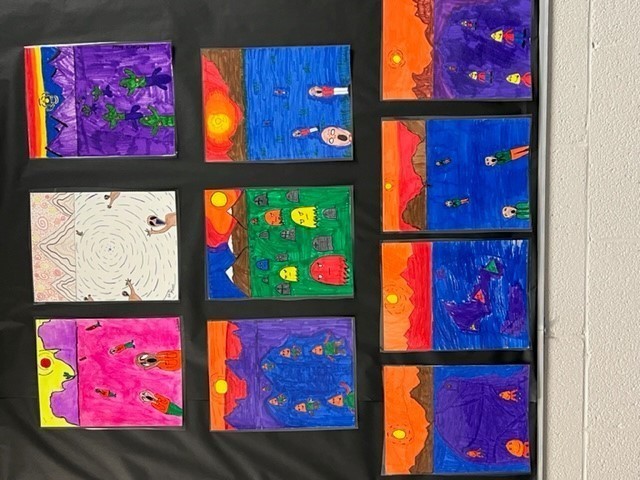
Last on our list of the Elements was Space. Various examples of the “space” works were depth in size (larger in the foreground), overlapping creatures, making the work BIG, doodle towers, and perspective. Because of time constraints, the students finished most of these just as we were going on break. These will be uploaded in our next report. Shown here are examples of the Depth-in-Size and Overlapping Shapes activity.
Upon returning from break, we will be delving into the next phase of Art – the Principles of Design!
